Angular Development: Control Flow

Welcome to the first in a series of blog posts on the Angular web development framework. This series aims to introduce you to some of the best, and in our opinion coolest, features of Angular and what makes it a great choice for building front-end web applications.
Written by Dan Bennett, Head of Software Development, Tier 2 Consulting.
Join us as we explore Angular’s Control Flow syntax and its role in modernising web development practices in our in-depth blog series.
Looking for expert assistance in software development? Discover how Tier 2’s custom software solutions can elevate your digital initiatives. Talk to Tier 2 for a bespoke software solution leveraging industry-standard Java technologies, agile development, and user-centric design.
What is Angular?
Angular is a development platform aimed at providing the tools needed to build high-quality web applications. It is typically used within a single page application (SPA) where everything is rendered dynamically within the browser using JavaScript and any interaction with back-end system(s) is performed via web service (REST) calls. Rendering an application in this way is seen as a positive because it eliminates page “flashing” and reloads: everything is loaded behind the scenes and only displayed when ready.
Angular was born out of AngularJS in 2016 when it was rebuilt to support Typescript and rebranded as Angular version 2.0. This change was huge in many ways but it has come even further since then with each major release bringing new features and conveniences. One of the key features from the latest (at the time of writing) version 17 is Control Flow.
See the official Angular documentation for more information on Angular and its history or the new interactive Angular dev guide to have a play with more of its features.
What is Control Flow?
Control Flow, or Control Flow Blocks, is one of the newest features of Angular, released in version 17. This version, which includes deferrable views, makes up one of the most significant updates to come to the platform since 2016 (we’ll cover deferrable views in a later article).
The new control flow syntax brings the functionality of the classic NgIf, NgFor and NgSwitch components into the core Angular framework in a new, more readable way. It was proposed as part of this RFC as a way of improving the “developer experience” and to reduce the pain of development caused by using structural directives; NgIf, NgFor etc. within regular code/markup.
In simple terms, it means a change to the way we write basic display logic within the component’s HTML.
- The *ngIf expression is replaced with @if for conditionality in the UI.
- The ngSwitch directive is replaced with the @switch block.
- The *ngFor expression is replaced with @for and has added support for @empty to allow placeholder code when the given iterable collection is empty.
The change from a directive style approach to explicitly defined code blocks presents several benefits, including:
- No need for a container element or template to hold the expression, meaning less markup.
- Support for type-safe checks within the template.
- The tracking expression in a for loop is now mandatory but also simpler to use compared to the previous version.
- Performance improvements due to a new optimized algorithm for calculating the minimum number of DOM operations performed in response to changes.
What does this mean?
To try and give you a better idea of what this means for a developer, below is a very simple use case of a shopping list that we need to display in a given order. To achieve this prior to Angular 17 we would use the following code to display a bullet-pointed list of each item on the shopping list within our application or to simply display an appropriate message if the list is empty: note the named ng-template block “#listEmpty”:
<div *ngIf="shoppingList?.length; else listEmpty">
  There {{ shoppingList.length > 1 ? 'are' : 'is' }} {{ shoppingList.length }} item(s) on your shopping list:
  <ul>
    <li *ngFor="let item of shoppingList">{{ item }}</li>
  </ul>
</div>

<ng-template #listEmpty>Your shopping list is empty!</ng-template>
We can update this using the new control flow syntax to clean this up and minimise unnecessary clutter, reduce the need for extra HTML markup and greatly increase code readability by separating logic from markup, all while producing the same result as in the previous example.
@if (shoppingList?.length) {
  There {{ shoppingList.length > 1 ? 'are' : 'is' }} {{ shoppingList.length }} item(s) on your shopping list:
  <ul>
    @for (item of shoppingList; track item) {
      <li>{{ item }}</li>
    }
  </ul>
} @else {
  Your shopping list is empty!
}
In the above example, we have replaced the directive style NgIf and NgFor commands with @if and @for which more closely represents the code inside a component class. This difference creates a clear distinction between HTML markup and display logic. We could further expand this logic and create an @else if clause as well which would have been impossible in previous versions.
Both examples above will dynamically display the following in the given situations:
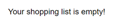
Empty shopping list
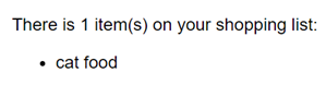
Shopping list containing 1 item
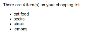
Shopping list containing 4 items
Continue reading to see some more examples of the control flow syntax and follow along to give this a try for yourself.
Try it!
In this section, we’ll create a simple grocery picker application to help us complete our shopping list.
Prerequisites
You must have Node JS and NPM installed and have a basic knowledge of using them. It would also be beneficial to have a working knowledge of using Angular.
If you’re new to Angular please see this guide to get you started.
Note: If you’re short on time or you’d rather just see a finished version to play with, you can check out this example from GitHub. However, we do recommend following along with the next section, particularly if you’re relatively new to Angular 17.
Setup
The first step is to install the Angular CLI on your environment as we’ll be using this to generate our initial components.
npm i -g @angular/cli@17
Setup a new project
Now we’re ready to begin creating our project, start with `ng new` to create the initial project and name it angular-control-flow choosing these options:
ng new angular-control-flow
> Which stylesheet format would you like to use? Sass
> Do you want to enable Server-Side Rendering (SSR) and Static Site Generation (SSG/Prerendering)? No
Once the Angular CLI has finished setting up your new project, continue to the next section to begin using control flow syntax.
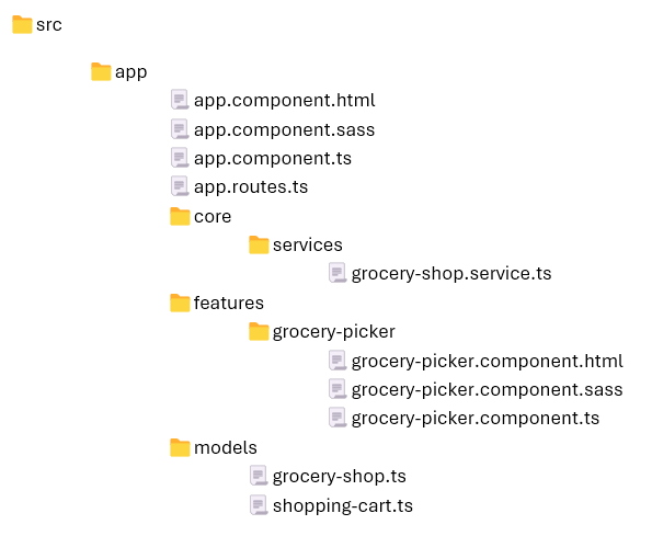
Create the project structure
Start by using the Angular CLI from the root directory to set up the initial classes. To create our new component class:
ng g component features/grocery-picker
To create our new GroceryShopService:
ng g service core/services/grocery-shop
To create the model classes that we will use for type safety:
ng g class models/grocery-shop
ng g class models/shopping-cart
This should create the following files – we can delete the unit test files (*.spec.ts) that the CLI generates for us because we won’t be using unit tests in this example:
Now that we have created the initial project structure; we can start adding some simple logic to the grocery picker.
Add logic to retrieve groceries
First, we’ll configure some model type classes. Navigate to src/app/models/grocery-shop.ts and add the following code:
export declare class GroceryShop {

    items: string[];
}
And then navigate to src/app/models/shopping-cart.ts and add the following code:
export declare class ShoppingCart {

    items: Map<string, number>;
}
We only need to create a declaration rather than a full class here because we’re just using them to help with type safety so make sure to use “declare class” to provide a simple type instead.
Next, we’ll set up our GroceryShopService to return a list of fruits and vegetables. Open the src/app/core/services/grocery-shop.service.ts class and add the following code:
@Injectable({
    providedIn: 'root'
})
export class GroceryShopService {

    async loadGroceryShop(): Promise<GroceryShop> {

        return {
            items: [
                'apple (green)', 'apple (red)', 'avocado', 'banana',
                'cherry', 'grapes', 'kiwi', 'lemon', 'orange',
                'pear', 'pineapple', 'strawberry', 'tomato', 'watermelon'
            ]
         };
    }
}
Note: in this example, we’re just going to provide mock data but in a real-world example this service could retrieve the data we need from a back-end service using fetch or the Angular HttpClient and translate it for the application.
Next, open the src/app/features/grocery-picker.component.ts class. In this class, we need to add a reference to a GroceryShop object and inject our GroceryShopService via the constructor.
groceryShop: GroceryShop | undefined;
shoppingCart: ShoppingCart | undefined;

constructor(private groceryShopService: GroceryShopService) {
}

async loadItems(): Promise<void> {
    this.loading = true;
    this.groceryShop = await this.groceryShopService.loadGroceryShop();
    this.loading = false;
}
For the purposes of this example we’ll use Angular’s OnInit function call loadItems automatically when the component is initialised.
export class GroceryPickerComponent implements OnInit {
...

    async ngOnInit(): Promise<void> {
        await this.loadItems();
}
Next, we need a way to choose an item to add to our shopping cart and remove an item from the cart. Add this simple function to handle this action:
chooseItem(item: string): void {
    const quantity = this.shoppingCart.items.get(item);
    if (quantity === undefined) {
        this.shoppingCart.items.set(item, 1);
    } else {
        this.shoppingCart.items.set(item, quantity + 1);
    }
}

removeItem(item: string): void {
    const quantity = this.shoppingCart.items.get(item)!;
    if (quantity > 1) {
        this.shoppingCart.items.set(item, quantity - 1);
    } else {
        this.shoppingCart.items.delete(item);
    }
}
Make the page accessible, add a route definition
We’ll add a quick route so the grocery picker component is accessible. Open the src/app/app.routes.ts file and add the following to the routes array:
{ path: 'grocery-picker', component: GroceryPickerComponent }
Display the grocery picker
Now that we have completed our setup, we can write the markup to display this and test out some of the features of the control flow syntax. Open the src/app/features/grocery-picker.component.html file (it is possible to include the markup directly inside the .ts file but it’s cleaner to keep this separation where possible).
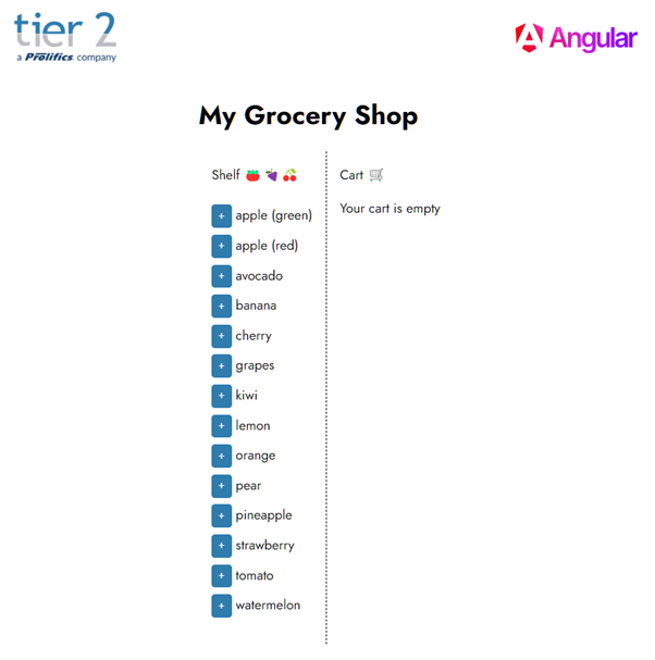
<h1>My Grocery Shop</h1>

<div id="groceries">
  @if (groceryShop) {
    <div id="list">
      Shelf 🍎🍇🍒
      <ul>
        @for (item of groceryShop.items; track item) {
        <li>
          <button (click)="chooseItem(item)">+ </button>
          {{ item }}
        </li>
        }
      </ul>
    </div>
    <div id="cart">
      Cart 🛒
      <ul>
        @for (item of shoppingCart.items.keys(); track item) {
          <li>
            <button (click)="removeItem(item)">- </button>
            {{ item }} ({{ shoppingCart.items.get(item) }})
          </li>
        } @empty {
          <p>Your cart is empty</p>
        }
      </ul>
    </div>

  } @else {

    <p>Sorry, we're closed! Please come back later.</p>
  }
</div>
In this example, we have used the @if and @for control flow blocks to create a “shelf” of items that are available from the grocery shop and a shopping cart to which we can add items to.
Finally, add the following styles to the stylesheet at src/app/features/grocery-picker.component.sass to make it look nice:
button
  border: 0
  outline: 0
  cursor: pointer
  color: white
  background-color: rgb(48, 124, 173)
  border-radius: 4px
  font-size: 14px
  font-weight: 500
  padding: 4px 8px
  display: inline-block
  min-height: 28px
#groceries
  display: flex
  flex-direction: row
  &> div
    padding: 1rem
    &:first-child
      border-right: 1px dashed
  ul
    padding-left: 0
    li
      list-style-type: none
      padding-top: .5rem
To test this out, we can use a built command from the Angular CLI:
ng serve
This command will load the application in a temporary server and automatically refresh the browser whenever any changes are detected.
Open your browser and navigate to the grocery picker application and the application should look something like this:
Let’s expand this a little. Firstly add an artificial delay when loading the grocery shop. Update the GroceryShopService so that the loadGroceryShop function matches this:
async loadGroceryShop(): Promise<GroceryShop> {

    return new Promise((resolve, reject) =>
        setTimeout(
            () => {
                resolve({ items: [
                    'apple (green)', 'apple (red)', 'avocado', 'banana',
                    'cherry', 'grapes', 'kiwi', 'lemon', 'orange',
                    'pear', 'pineapple', 'strawberry', 'tomato', 'watermelon'
                ] });
            },
            2000 // Timeout of 2 seconds to simulate loading from a back-end service
        )
    );
}
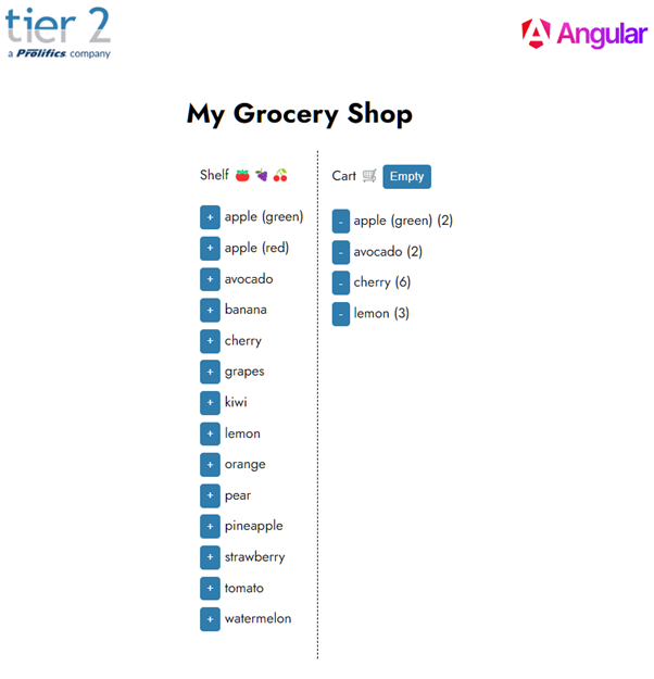
Update the component HTML to add a new condition which displays a message while waiting for the grocery shop items to be loaded. We’ll also add an “Empty” button to the cart for convenience, only displayed when there are items inside the cart to remove.
<h1>My Grocery Shop</h1>

<div id="groceries">
  @if (!loading && groceryShop) {
    <div id="list">
      Shelf 🍎🍇🍒
      <ul>
        @for (item of groceryShop.items; track item) {
        <li>
          <button (click)="chooseItem(item)">+ </button>
          {{ item }}
        </li>
        }
      </ul>
    </div>
    <div id="cart">
      Cart 🛒
      @if (shoppingCart.items.size) {
        <button (click)="clearCart()">Empty</button>
      }
      <ul>
        @for (item of shoppingCart.items.keys(); track item) {
          <li>
            <button (click)="removeItem(item)">- </button>
            {{ item }} ({{ shoppingCart.items.get(item) }})
          </li>
        } @empty {
          <p>Your cart is empty</p>
        }
      </ul>
    </div>

  } @else if (loading) {
    <p>Please wait while the grocery shop is loading...</p>
  } @else {
    <p>Sorry, we're closed! Please come back later.</p>
  }
</div>
The grocery picker should look something like this after you’ve added some items to the cart:
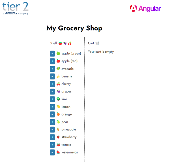
We can go a little further and add some colour using a switch statement. Open the file grocery-picker.component.html file again and update the HTML to add a new control flow @switch block that we can use to determine which icon to display for a given item on the shelf.
<h1>My Grocery Shop</h1>

<div id="groceries">
  @if (!loading && groceryShop) {
    <div id="list">
      Shelf 🍎🍇🍒
      <ul>
        @for (item of groceryShop.items; track item) {
        <li>
          <button (click)="chooseItem(item)">+ </button>
            @switch (item) {
              @case ('apple (green)') { 🍏  }
              @case ('apple (red)') { 🍎  }
              @case ('avocado') { 🥑  }
              @case ('banana') { 🍌  }
              @case ('cherry') { 🍒  }
              @case ('grapes') { 🍇  }
              @case ('kiwi') { 🥝  }
              @case ('lemon') { 🍋  }
              @case ('orange') { 🍊  }
              @case ('pear') { 🍐  }
              @case ('pineapple') { 🍍  }
              @case ('strawberry') { 🍓  }
              @case ('tomato') { 🍅  }
              @case ('watermelon') { 🍉  }
              @default { ◼ }
            }
          {{ item }}
        </li>
        }
      </ul>
    </div>
    <div id="cart">
      Cart 🛒
      @if (shoppingCart.items.size) {
        <button (click)="clearCart()">Empty</button>
      }
      <ul>
        @for (item of shoppingCart.items.keys(); track item) {
          <li>
            <button (click)="removeItem(item)">- </button>
            {{ item }} ({{ shoppingCart.items.get(item) }})
          </li>
        } @empty {
          <p>Your cart is empty</p>
        }
      </ul>
    </div>

  } @else if (loading) {
    <p>Please wait while the grocery shop is loading...</p>
  } @else {
    <p>Sorry, we're closed! Please come back later.</p>
  }
</div>
Now that we have added a relevant icon for each of the available items on the shelf using the switch case; the final application should look like this:
Summary
In this article we have demonstrated how to use the new Control Flow syntax in Angular 17 including:
- @if, @else if and @else
- @for and @empty
- @switch and @case
This new syntax may cause a bit of a headache for developers who are upgrading from a previous version of Angular and want to adopt this approach, but overall it makes the code a lot more readable and thus easier to maintain. It also aligns the logic within the template markup more closely with the logic within the component itself, so may be less of a learning curve for developers brand new to Angular.
In the next post in our Angular series, we’ll be talking about the Angular Signals system and how it can be utilised to improve state tracking at runtime.
How can Tier 2 help?
If you’re in search of expert assistance in software development, Tier 2 is your dedicated partner. Reach out to discuss your specific requirements and discover how our custom software solutions can elevate your digital initiatives. Talk to Tier 2 for a bespoke software solution leveraging industry-standard Java technologies, agile development, and user-centric design.